Vancouver Voters’ Guide
The Vancouver municipal elections were held in October 2018. Many months before, in April, the design and communication processes began in earnest. There were several outreach programs in the months leading up to October that involved public consultations. Informative display boards, handouts and online information were essential for these events.
Gary was approached by the City of Vancouver to help with design and production on the election items, of which some are listed below. Many of the items were designed in the vibrant geometric graphics from the bi-elections back in 2017, then later the City of Vancouver offered up new brand guidelines that Gary used to design the remaining items for the elections.
Below are just a few of the items that were needed in the election that Gary design or produced:
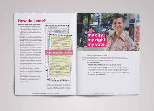
The Vancouver Voters’ Guide
Having determined an elegant set of typographic styles and layouts for a 57 page Vancouver voters’ guide was one feat that Gary took in his stride. His easy to read layouts allowed the public fast access to helpful facts and information regarding the Vancouver election.
The guide was not only provided in English and French, but two other languages, and a version in larger print for those needing content at 16 point or larger for legibility. What was covered in the guide ranged from why the election was happening and how to register, participate, and use your Voter Information Card (VIC), to when and where you could vote.
Unlike previous years where the City of Vancouver had names on the ballot in alphabetical order, the names for this election were going to be in random order. To prepare voters for this randomized list of candidates, the City of Vancouver created the handy “Plan Your Vote Worksheet”, and added it into the voters’ guide. The worksheet was much appreciated by the public – voters felt this added time saving value to their voting experience.
The Personalized Voter Letter and Voter Information Card (VIC)
The personalized voter letters and Voter Information Cards (VIC) were mailed out to all registered voters in preparation of the Vancouver election. After careful consideration of the printers needs and Canada Post’s requirements, Gary built a design that best answered each of these requests and restrictions. What was achieved were clean and well balanced communication pieces that packaged up neatly and visually tied into each other as an entire suite.
The election online web graphics, postcards and posters
The election online web graphics, postcards and posters started off with vibrant geometric designs that were consistent with the bi-election brand of 2017, however in late July the campaign underwent a design transformation and the City of Vancouver offered up a new visual identity for the remaining communication items. Gary took the guidelines and incorporated the new look over into the voters’ guide, posters, postcards and advertisements.
Advertisements
Gary’s responsibilities also branched out to designing newspaper and community ads for the elections. Some of these election ads were required by law to publish wordy content that could have made many designers cringed at the prospect, but embracing the challenge – and the word count, Gary provided orderliness and clean typeset columns to visually create a more pleasant read.


